Podcast Cover Art That Converts: How to get them to press play
Learn how to design professional podcast cover art that attracts your ideal listeners, strengthens your podcast branding and stands out on Spotify, Apple Podcasts and YouTube.
Before someone listens to your podcast, they usually see your cover art. That small square image is one of the first chances you have to show what your podcast is about, who it is for and why it is worth their attention.
Great podcast artwork does not need to be complicated or expensive. It needs to be clear, recognisable and relevant to the people you want to reach. Whether you are launching your first show or updating an existing brand, these practical podcast cover art tips will help you make a stronger first impression.
Why podcast cover art matters for your podcast brand
Your artwork appears across podcast directories and listening apps. It often sits among dozens of competing shows, sometimes displayed as a very small image on a mobile phone. Listeners may decide whether to explore your show before they have heard your voice.
Professional podcast cover art helps communicate your topic at a glance. If the design looks cluttered, confusing or disconnected from your message, potential listeners may keep scrolling. If it looks relevant and easy to understand, it can give them a reason to learn more.
For women in business using podcasting to build authority and attract clients, this first impression also influences how people perceive the wider business brand. Cover art alone will not generate leads, but it can help the right audience recognise and explore your content.
The three essentials of effective podcast cover art
1. Clarity: make the podcast topic obvious
listener should not have to decode your artwork. Use a strong, readable podcast title and imagery that makes sense for your subject. Avoid crowding the design with a subtitle, long tagline and multiple competing messages
For example, a gardening podcast called “Gardening for Beginners” with relevant imagery tells new listeners much more than an unfamiliar personal name on its own. Aim for the same immediate clarity in your niche.
2. Brand consistency: look and feel like your business
Your podcast is part of your wider brand. Choose colours, imagery and a visual style that match the experience people can expect from your episodes. If you have an established business identity, use it as a starting point without forcing every brand element into one small square.
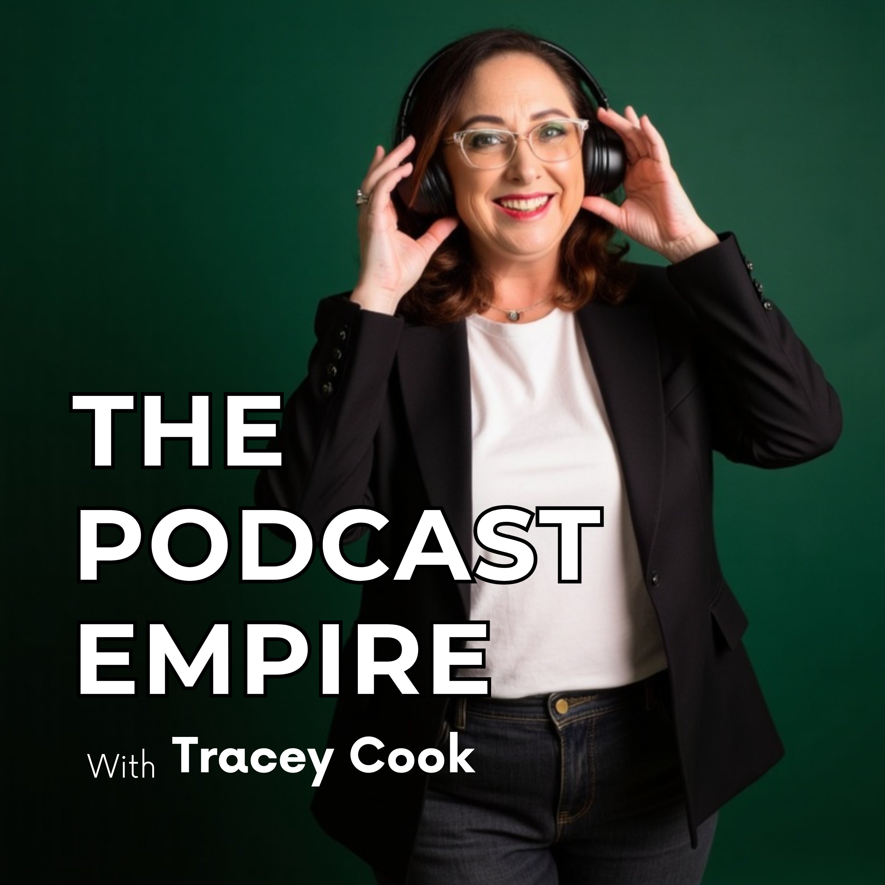
Personal imagery can be particularly effective where the host is central to the brand. The image, clothing, setting and overall mood should fit the podcast topic. A strong visual connection between the host and the subject helps reduce confusion.
3. Visual hierarchy: Make the important details stand out
Visual hierarchy means giving the most important information the most attention. Usually that is your podcast title. Use bold, legible type, adequate contrast and enough space around the words so the artwork remains easy to read when reduced to thumbnail size.
Check the design on a mobile screen, not only on a large desktop monitor. If the title disappears when you shrink the image, simplify it.
Common podcast cover art mistakes to avoid
Some design choices can weaken an otherwise strong podcast concept.
Watch for these common problems:
•Too much text. Long taglines and several font styles make the message hard to scan.
• Small or decorative lettering. Delicate script fonts often become difficult to read at thumbnail size.
• Low resolution artwork. Blurry or pixelated images reduce the professional finish.
• Weak contrast. Text and background colours that blend together make the title disappear.
• Generic images. Stock photography without a clear connection to your topic may fail to show what makes your show distinctive.
• Off-brand visuals. Imagery that conflicts with the subject creates uncertainty about who the podcast is for.
Podcast cover art versus YouTube thumbnails
Podcast cover art and YouTube video thumbnails serve related but different purposes. Your podcast cover art identifies the overall show on listening platforms such as Spotify and Apple Podcasts
If you distribute an audio podcast to YouTube through an RSS feed, your show artwork may also be used as the static visual for the audio episode. If you upload filmed video podcast episodes to YouTube, the individual video thumbnails are separate assets that can be tailored to each episode’s topic.
Both should feel connected to your brand, but they do not need to be identical. Think of podcast cover art as the identity of the show and video thumbnails as the invitation to watch a particular episode.
How to create podcast cover art that attracts the right audience
Step 1: Define the listener and your podcast promise
Before choosing fonts or colours, get clear on who the podcast helps, what it covers and what someone will gain by listening. Your visual choices should support that message.
Step 2: Choose one strong title and relevant imagery
Make your podcast name easy to see. Choose a photo or illustration that reflects the subject. If you use a portrait, make sure it feels natural and appropriate for your niche.
Step 3: Keep colours and fonts simple
Use a restrained colour palette, a readable font and a clear contrast between text and background. Give the title space to stand out.
Step 4: Test the design at a small size
View your artwork on a phone or scale it down to the size it will appear in a podcast app. Can you still read the title and understand the theme? If not, remove details until the message becomes clearer.
Step 5: Create the final artwork and check platform requirements
You can make your own design using Canva or brief a graphic designer. Before publishing, check the current artwork specifications required by your podcast host and the platforms where your show will appear.
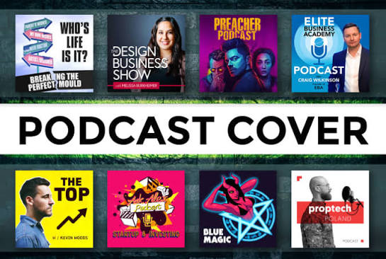
What makes podcast artwork more likely to get a click?
The most effective design is not necessarily the most elaborate. It is the one that quickly answers the listener’s question: “Is this podcast for me?” A clear title, relevant visual identity and mobile-friendly layout all help support that decision.
When your cover art reflects your content and brand, people are more likely to recognise the show as they discover your episodes. From there, the quality and relevance of your content are what build trust and encourage them to continue listening
Final thoughts
Podcast cover art is more than decoration. It is a practical part of your podcast branding and discoverability strategy. Start with clarity, build a consistent visual identity and test everything at the size your audience will actually see.
You do not need a complicated design to make a strong impression. You need artwork that speaks to the right person and gives them a clear reason to press play
Join VideoPod Network
Launch your video podcast in 30 days with VideoPod Network, plus the templates, prompts, and playlist funnel roadmap to turn episodes into leads.
Enrol in The Podcast Mastery Program
Join the Podcast Mastery Program and build a client attracting YouTube video podcast with a clear strategy, streamlined systems, and The Podcast Playlist Funnel Method. Includes Podcast host Certification.
Keep showing up, and I will see you in the pod.
TC x


